Pastiche or homage?

On a recent visit to the Queensland Art Gallery I was intrigued by a number of images and realised that they reminded me of works by other artists.

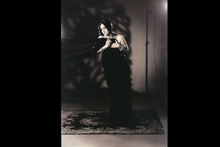
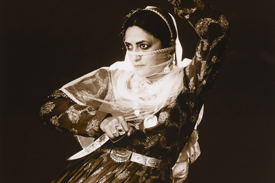
First up was a small group of photographs in the Asian section which I found striking in their simplicity and in the power of their gaze.  They were by an Indian photographer – Pushpalama N, – whom I’d never heard of – whose images are  very much like those of Cindy Sherman.  And like Sherman, Pushpalama N. explores narrative figuration and uses herself as the model, in a variety of guises.

She was born in 1956 in Bangalore and originally trained as a sculptor then went on to work in performance photography and film using elements of popular culture to explore place, gender, history. According to artsy.net, Pushpalama N. is a “photo-and video-performance artists [who] plays the subject in images that critique female stereotypes in India and the reductive classifications furthered by ethnographic documentation.”  Hmmm.  Not sure what that means but essentially she re-enacts historical representations of women in order to subvert them.  Just like Cindy Sherman.

No matter the text (or for that matter the sub-text), the works are striking and powerful and well worth checking out.  I have to praise the curator of this little show for the strength and vision here; I browsed the web for images of Pushpalama’s work to illustrate this blog and mostly I was unimpressed with what I saw.  But the selection of black and white photographs at QAG is quite stunning and well worth a look.

Cindy Sherman

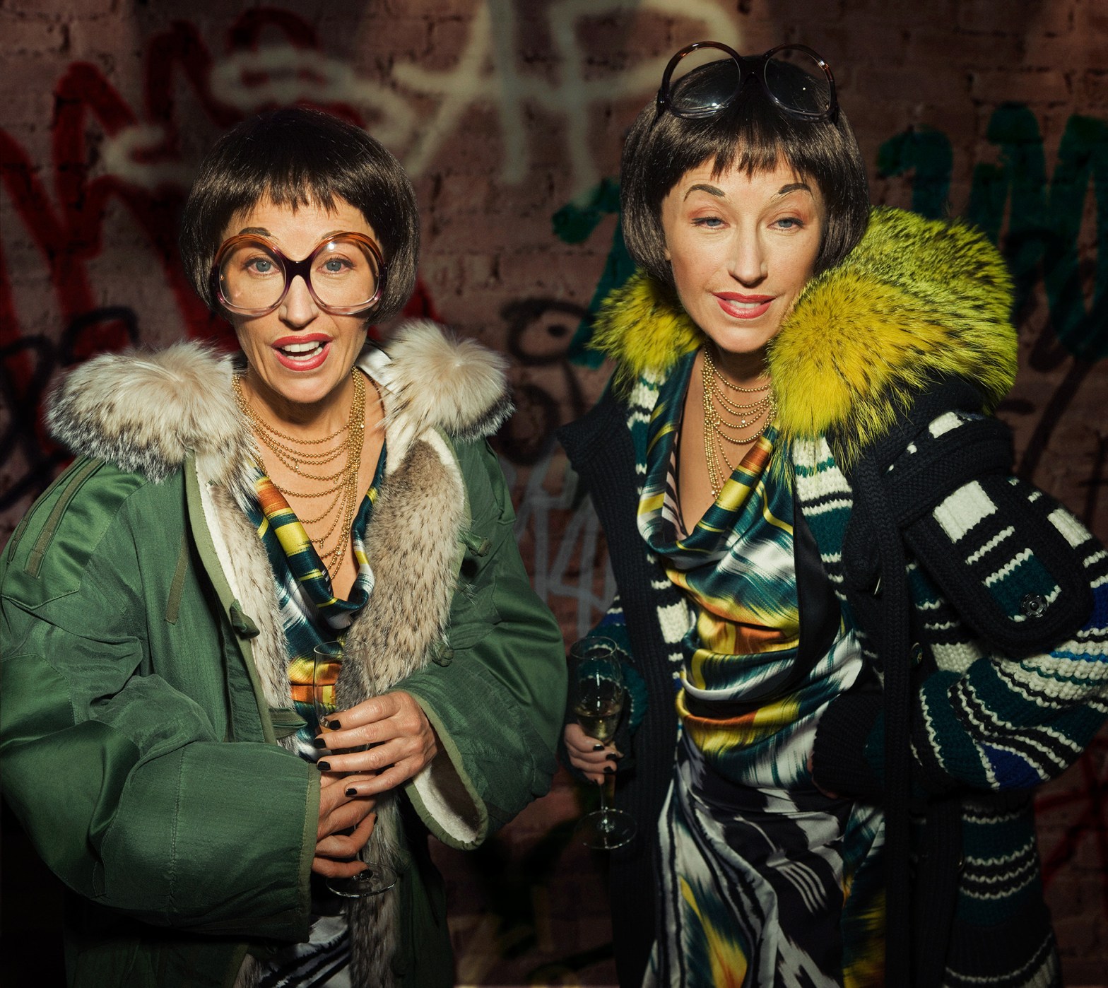
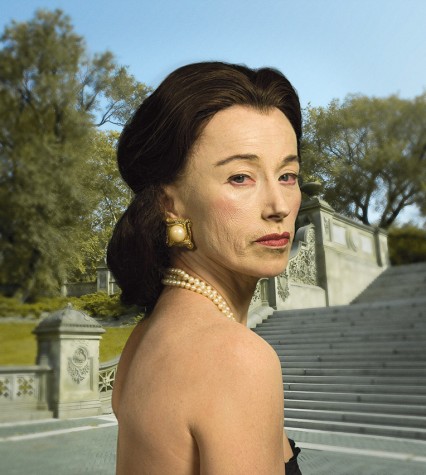
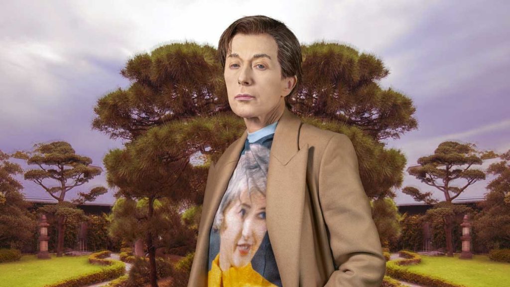
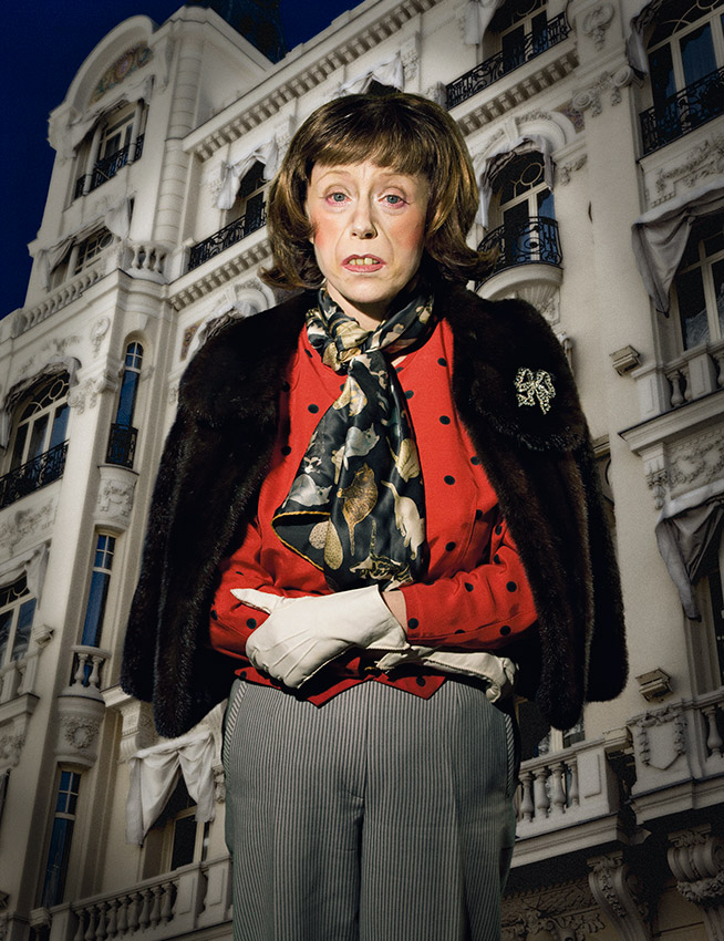
There’s a large show of recent Cindy Sherman works at QAGOMA which I had seen on a previous visit but had to see again. I’m a Cindy Sherman fan; her earlier photographs remind me of stills from film noir but more than that I’m fascinated by her craft: her skill in creating narratives and in transforming herself into highly constructed character studies.  They are performance pieces. Interestingly, according to QAGOMA, “Cindy Sherman is one of the most recognised and influential artists of our time”.  Yet no-one really knows what Sherman looks like.  She uses herself as a model for all her works, but through the use costumes, makeup, prosthetics (and more recently digital photography) Sherman transforms herself into highly stylised characters. There are no depictions of Cindy Sherman.

The images in this current show are very different to previous ones – in content, scale and in Sherman’s use of digital technology, especially Photoshop.  But the biting satire and commentary are still there.  There is a wonderful series of 5 metre-tall ‘society portraits’ from 2008, and two rather subversive fashion house collaborations, the Vogue-commissioned ‘Balenciaga’ 2007­–08, and ‘Chanel’ 2010–2013 in which Sherman clothes her everyday women in haute couture, placing them in incongruous settings.   They’re not fashionable or stylish and the result makes you re-think the whole notion of ‘fashion’, of who it’s for and how it ends up. It’s also a commentary on our society’s fascination with aspiration, narcissism and the cult of celebrity.”

Sally Gabori

The other works that impressed me (and that I had to come back for another look) are by Mirdidingkingathi Juwarnda Sally Gabori (my spellcheck’s having difficulty here so I’ll refer to her as Sally Gabori), a Kaiadilt woman (from the Gulf of Carpentaria, off north-western Queensland) who began painting at the age of 81.

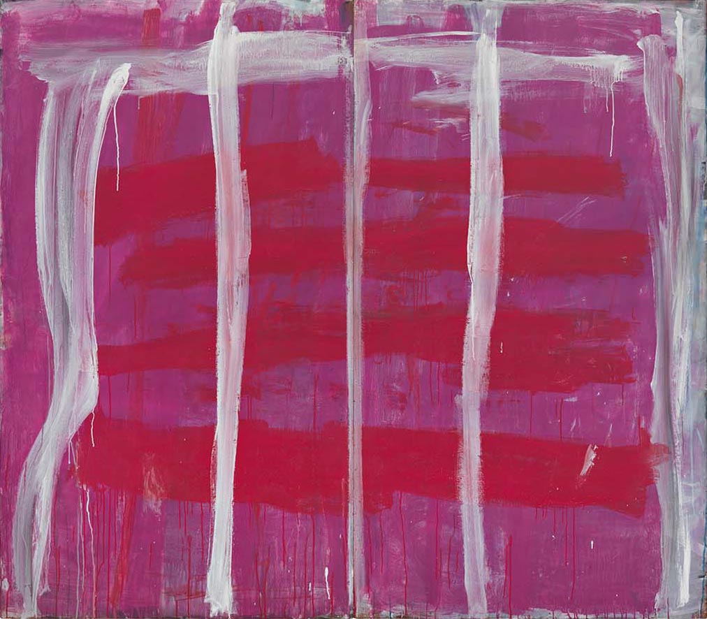
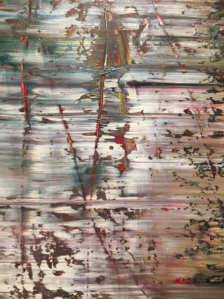
Large intensely coloured canvas, bright and block like.  Powerful images.  This was new indigienous art and I was impressed.  I’m not sure that anyone’s really game to talk about indiginous art except in very traditional non-formal terms.  For some reason (the ovious ones) aboriginal/indigenous art isn’t scrutinised and critiqued in the same way as other art.  What I found so refreshing about these works was not just their vibrant palette but their intensity and the way the paint was applied – not a dot or line to be seen – let alone a smudge of ochre.  It was almost colour-field and indeed reminded me very much of the huge fluid painting of Helen Frankenthaler. Interestingly, the little extended labels (the things that people most usually look at longer than the art work) said not a thing about the construction of the work.  Instead it was all about ‘country’.  I didn’t really understand what the relationship of country was to the visual representations on these framed canvases but I was keen to find out.

This exhibition is a retrospective; it includes her early paintings, her large collaborative works with other Kaiadilt women, and her almost monochromatic recent paintings and works on paper. The experts say that the paintings are “depictions of her homeland …. abstract in nature, but retain representational elements which map traditional country and cultural identity in monumental paintings.”[Jeremy Eccles,SMH]  One thing is certain:  in both the design and the boldness of her colour Gabori’s work is unique in Aboriginal art.

What’s striking to me is the (apparent) lack of traditional iconography (though again, I think it’s interesting that the labels speak about country rather than the painting).  Nicholas Evans in his obituary  in The Australian wrote that: “Beyond the names she gave them, Gabori was reticent about revealing the exact interpretation of her paintings. My view is that they are worked up from distinctive blocks of light or colour, emanating from the land and sea at the locations she names; the landscapes are transmuted so radically that they are barely recognisable.”

So why can’t we just read them as abstract paintings and critique them in the same way we do other similar (i.e. abstract) works?  I suspect it’s the artistic equivalence of political correctness. Interestingly,  there is a painting by Australian abstract artist Tony Tuckson just around the corner from the Gabori, and if you didn’t know you’d be forgiven for thinking it was a Gabori painting.  I was (again) struck by the similarities.  And again, I have to wonder: why can’t we talk about these works within the same terms of reference?  They’re clearly very similar.  Ah, the art world.  When it adopts political correctness, it’s anyone’s guess.

Tony Tuckson, Pink lines (vertical) on red and purple 1970–1973

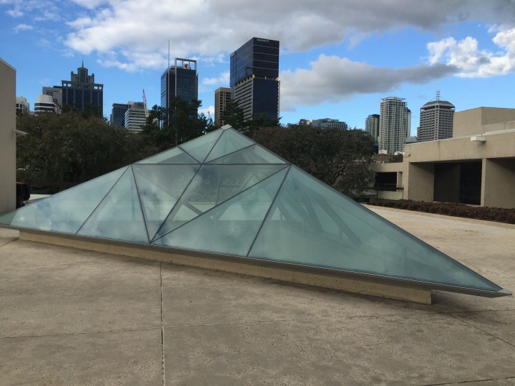
And finally, a piece that made me laugh out loud (particularly in its quotidian pasticheness) was a 3-D glass and metal sculpture  in situ outside the art gallery:  a mini pyramid, paying homage to The Louvre’s Pyramid. l I have no idea of who this is by – or for that matter, what it is – but I thought it was imminently fitting that it was there.

So next time you’re in sunny Queensland wandering what to do – go take a wonder around the galleries.  You’ll be surprised at what you find.

Melbourne – my kind of town

Its been a while since I’ve been in my old city. A long time since I lived here and quite a while since I’ve visited. My kids live in Melbourne now – both in Northcote. When I last lived in Northcote it was just outside the fringe; Fitzroy was still the happening place. Further down along the tram tracks you entered a more suburban environment. No bars or groovy cafes there.  Now things have changed. And then some. High Street Northcote is abuzz with bars and cafes and great little shops and lots of wine shops stocking interesting, reasonably-price wines to try.  I did.

Dogs are a part of inner-city (just outer-city?) life. Everyone seems to have a four-legged beast beside them at the many outdoor tables along the street. Mia, my Iggy, was in fine company – well attended to with water and treats provided by the friendly staff.  Ah Melbourne. It’s the civilised city where bars and licensed cafes are open all hours.  Try finding a place to have a drink and a bite to eat after 2.30pm in Sydney or Brisbane. Sorry, you’ll have to wait till 5.00pm when they re-open again. As for Sundays and Mondays.  Sorry: we’re closed. Sigh.  It doesn’t make for good city wandering when you’re out and about not doing much just wanting a drink and bite to eat.

I love Melbourne. It has presence. Gravitas. And its funky. Its my kind of town.

Traveling solo

It’s raining as I sit here looking out the window at the Brisbane terminal. I’m on my way to Melbourne to visit family and friends.  Its been a while.  COVID put a stop to our ordinary connections, our ability to decide to go visit and catch up, to see an exhibition, to join friends or family for a celebration. We stayed home. Alone. But now finally, we get to travel once more and pick up on our long-ago connections.

Ironically, its raining in Brisbane while Melbourne basks in warm sunshine. For a while. You never know what’s really going to happen in Melbourne, weather wise.

I’m travelling with my little companion, although not quite.  Mia, my little Iggy is flying in style in another section of the plane.  I use the term “style” ironically.  She’s in a plastic travel crate which she can’t stand up in, confined and on her own.  This for a dog who shadow me wherever I go is going to be traumatic. She rarely leaves my side – she lies on her fluffy mat upstairs in my study, if I go downstairs to get something, she comes down too and then follows me back up again.  If I’m downstairs at the dining-table she lies on her mat near-by.  If I’m on the sofa, she’s right there next to me.  At night (and often I suspect when I am out) she’s there at the foot of the bed, lying on the throw.  So for her, my trusty companion, its not going to be the exciting or stressless journey that I’m undertaking.

The strange thing about this journey is that although I am flying solo, as I have done many times in the past, I have left solo and I shall return solo.  There is no-one to see me off, to help me gather myself and my bits and pieces (or to hurry me along) and there is no-one to greet me on my return.  There will be no-one to present me with a drink orglass of wine and a well-considered meal, let alone a much-needed hug and the smile of joy on seeing me. There is no-one to report back to, to miss and say hello in the way you do when you travel away from your partner.  This time it’s just Mia and me. It feels strange and I don’t feel the same level of excitement and enjoyment that I used to in the past. It just reminds me that now, its just me.

Its very strange to be “just me”. I haven’t yet worked out what that means. Apart form the loneliness that seems to track me like a shadow, and the realisation that spontaneous holidays – “Hey, why don’t we go to…?” are no longer a possibility.  Holidays solo are not something I have mastered and wonder if I ever will. It just seems like I’d be trading one environment for another.  Part of the pleasure of holidays is the experience of discovering new things, sharing adventures, food, sights, moments, delights. Ach weill. Such it is.

For now, I do have landing to look forward to and being met by family and friends in various locations. I shall be grateful for their love and companionship but I shall be also aware of me new solo existence, where once-upon-a -time I was either on my own away from my partner or there together with him, I was somehow defined by that. In some ways this trip represents my first ever solo journey and an opportunity to discover who I am – and how I am – solo.

Cooking with love

Tomorrow afternoon my beautiful daughter leaves for home. She’s been here with me for 6 months now. She’s been my support person and my angel all through Michael’s hospitalisation and dying. I couldn’t have coped without her.

Tonight we’re off for a farewell dinner with some of our fellow dog humans, so yesterday was our last meal together. I wanted to cook something special. For Pip that was my tuna niçoise; for Chris, a steak. Sounds simple enough, except that the niçoise recipe I wanted to do is complicated, requiring much prep. Steak and oven-crisp potatoes? Easy. Except for the timing. Everything seemed to require cooking at the same time. The green beans needed to be blanched. The kipfler potatoes boiled then peeled, sliced and pan-fried to crispness. The olive tapenade needed making, as did the tuna mayo. The tuna needed searing. The potatoes for the steak needed time in the oven but meanwhile I was also making stuffed Padron peppers that needed 15 minutes in the oven. The steak was huge and discovering that the BBQ wasn’t working, it needed to be cooked on the stove and then finished in the oven. My oven only has two shelves.

Oh and then there are the poached eggs that need to go on top of the salad. That’s last minute. But turned out everything was last minute. The kitchen was a mess. But it was worth it, and besides, I don’t know when I’ll cook like that again. From now on its just meals for one. Plain and simple.

For those interested, here’s a link to the tuna niçoise recipe courtesy of Amanda Ruben.

What goes on in your mind?

I’ve been thinking about Michael and how he died without being able to communicate; a tracheostomy inserted into his windpipe in order to breathe meant that his voice box couldn’t work. At first he tried, very valiantly, to speak in the hope that we would all be able to understand. To read his lips. But Michael was never one for brevity: a simple ‘yes’ or ‘no’ would not suffice when he could construct elaborate sentences. None of which we understood. He wasn’t able to hold a pen properly so it wasn’t possible for him to write. Neither was he able to use any digital devices. I lived in hope. I thought things would improve; that the trachy would come out and he’d be able to speak again. I thought he would come home.

Instead, he died. And I don’t know what he was thinking. What went on in his mind.  Was he lucid and understood what was happening? Did he know he was dying? Was he scared? When I think about how alone he was in that whole process, grief overwhelms me.  I can’t bear to think of his suffering, his not knowing, his being alone. I wish I knew what went on in his mind.

Ashes to sea

Yesterday I travelled to Sunshine Beach to scatter some of M’s ashes into the sea. I hadn’t planned on doing this. We were such itinerants that no one place seemed to be “our place” so I had organised to send half of his ashes to his daughters in Melbourne and half to his family in Edinburgh (his eldest brother now lives in the house that Michael’s parents lived in, way up north). It seemed fitting that he should be left amongst family. But then last time I went to Noosa I realised how much the beach meant to both of us. How much we enjoyed walks along the beach and the utter delight of jumping waves. Mesmerised by sea and sky there was a tranquility in walking, not really talking, just walking and enjoying. Always commenting on how gorgeous the place was. God’s own place.

So it seemed fitting that I should take some of Michael’s ashes and scatter them amongst the waves in that place we so enjoyed. No ceremony, just me and the waves. I then wrote Michael’s name in the sand and scattered the very last bits of him over and then sat and watched as the waves lapped closer and then took him away.

Burnt toast and kerosene heaters

Last night I had a hankering for some toast – just some plain toast with a smear of vegemite.  Down I went into the kitchen and put the bread in the toaster and waited for what seemed like ages.  Impatient, and sure that the toast must be ready I pressed the cancel button and up it popped. It wasn’t even golden. I took one slice out and buttered it and re-set the toaster for the other slice. Not wanting to burn it I pressed the cancel button after a short while only to find again it hadn’t toasted enough. I like my toast darkish and crunchy. Oh well, I couldn’t be bothered waiting any longer – it seemed that the more sophisticated the toaster the longer it takes to toast.

Strangely, what I found unsatisfactory about my toast was that it didn’t have that wonderful ‘toast’ smell, the almost burnt but retrieved just in time smell.  When I was a kid we had one of those manual toasters with doors that you opened on each side and an element in the middle.  You had to  turn the toast over to toast it on both sides.  The bakerlite handles would usually get very hot so it was an exercise in trying to not burn the toast or your fingers.  But of course five times out of ten the toast would be burnt.  And then scraped into the sink.  You simply retrieved what you could. Burnt toast is what I grew up with.  Everyone was usually either too impatient or too busy to stand at the toaster, constantly opening the door and checking.  And to check you had to ensure that the toast came away from the element (hence another reason for burnt fingers and warnings of not sticking knives into the toaster).  These days you can’t make burnt toast:  the smoke alarm in the kitchen goes off way before your toast is truly burnt, plus of course all the settings on toasters mean that (potentially) you have the perfectly coloured toast of your choice.

I also discovered that vegemite is no longer the same. I very rarely eat the stuff but always have a small jar (and I mean the smallest one you can buy) in the cupboard – usually for my kids. The last jar I bought was a couple of years out of date but still two-thirds full. Doubting that the stuff could really go off I nevertheless threw it away and bought some more.  I discovered that vegemite now comes in squeeze tubes. I was sceptical about this but thought it would probably solve the going off problem. Disappointingly, it doesn’t taste at all like vegemite used to.  

My walk down memory lane brought back memories of kerosene heaters in the kitchen and the kettle that would sit on top and the hot water bottles that would be filled from the the kettle.  And our fridge with its tiny little freezer compartment. I don’t remember it containing anything except those aluminium trays of ice that had a mechanism that twisted the metal divisions of the tray so that the ice could come out, and ice cream – first in rather lovely decorated tins and later in cardboard packs.  I still remember shelling peas so there weren’t any packets of frozen peas in the freezer.  Actually the freezer probably couldn’t fit anything else except the ice cream and all the built up ice that meant the defrosting of it was a regular job we had to do.   And no doubt accounts for my dislike of cleaning out the fridge.  Thank god we don’t have venetian blinds any more – that was another awfully tedious holiday job.  But more of that later.

I’ll leave you with thoughts of ‘snap crackly and pop’, ‘choco loco’ and Kraft spreadable cheese. Of course we did get more sophisticated in the ’70s and learnt how to make  everyone’s favourite party offering: French Onion dip (combining a packet of cream cheese with a packet of dried instant French Onion soup mix).  How times have changed.

Lost in Space

Prompted by some memorable moments from films and TV series, I found myself thinking about our childhood cinematic experiences and how easily amused we were.

It began with some classic lines from one of my favourite films, Ferris Beuller’s Day Off  – a 1986 film which I initially thought was going to be one of those god-awful Russian communist propaganda films – how wrong I was!!! “Anyone? Bueller. Anyone? Bueller.”  –  never ceases to bring a smile to my face.

Then my brother quipped: “Danger, Will Robinson, danger!”  which led me to thinking about this space age family Robinson, with their groovy clothes, flying about in their “state of the art” space ship.  Lost In Space  was created in 1965 and set in the future age of space travel – 1997! There was the  glamorous Judy with her long, coiffed blonde hair and the dark and surly boyfriend Major Don West; the sensible mother Maureen and the handsome father, Professor John Robinson with his tight polo tops and pants. They were the height of cool. Penny (Angela Cartwright), the younger sister was the sensible counterpart to her brother Will’s (Billy Mummy) adventurous escapades.  And of course, Dr Zachary Smith the simpering, cowardly, saboteur (“Oh, the pain, the pain.”)

But the real star was the robot, whose arms (made out of concertinaed pipes would wave about and his glass domed head spin as he would warn Will Robinson of danger. And of course: “Aliens approaching.”

Lost in Space consisted of adventures/escapades in alien worlds created with some very basic set design.  It was all too obvious, but we didn’t care, we were still captivated, glued to the screen waiting to see what would happen. How easily pleased we were.  Essentially the premise was that while Major Don West and Professor John Robinson were busy trying to fix the space ship and Judy and her mother involved in household tasks (!) Will and the robot would go on adventures. Sometimes Penny would join them but more often she was left playing with her little pet.  Often the adventures involved Dr Smith attempting to orchestrate his departure by whatever dastardly means he could and then Will and the robot having to deal with the resultant dangerous situations.   We knew the plot, we knew the outcomes but still we watched.  Mesmerised.  Gullible.  I don’t think much has changed – only the sets have become more sophisticated.

Gerhard Richter – the life of images

If you don’t know who Gerhard Richter is, you’re probably not alone.  He is considered to be one of the greatest artists of out time, having had extensive exhibitions at both the Tate and the Pompidou yet he has been glaringly absent from any collections in Australia.  This exhibition at QAGOMA is a first for Australia, and a real coup.

Richter’s oeuvre is prolific and stylistically varied: “I like everything that has no style: dictionaries, photographs, nature, myself and my paintings,” he says.  His artwork references other historical images and he often makes use of photographs, distorting them to create something entirely new. Birkenau (2014) consists of 4 large panels which seem to be completely abstract – black, white, green and red paint over a grey background.  But in fact these are based on photographs taken in secret by a Jewish prisoner in the Auschwitz-Birkenau concentration camp in August 1944. Richter took copies of the photos, blew them up and painted over them again and again until they appeared to be monumental abstracts.  

Elsewhere, Richter creates works of art using the twin mediums of photograph and paint to present the viewer with a conundrum:  deliberate defacing of photographs or a merging of visual forms to create a new way image? In the “Overpainted Photographs”, Richter smears oil paint over commercially printed post-card sized photographs. The paint is then pressed or scraped or lifted to give various effects. The photographs are just legible beyond the paint. You can just make out the scene below the paint: a beach, a new mother,  a familiar landmark or monument.  It’s an interesting artistic device: we peer to identify what’s below the paint and once having identified the image we return to regard the paint and the image as a whole.  An entirely other work of art.

His work is both illusory and painterly. Richter is a master painter – his still-life paintings are almost photographic – photo-realist – but what I found more interesting are the photographic-like portraits that he then blurrs, sometimes only slightly, other times more severely. He uses a kitchen squeegee to move the paint over the canvas once its almost dry, thereby keeping the image intact.

Among the artworks on show at QAGOMA are the iconic portraits Reader (804) 1994 and Ella (903-1) 2007, still-life paintings including Two candles (499-4) 1982 and Orchid (848-9) 1997, and the evocative landscapes such as Meadowland (572-4) 1985 that evokes German Romantic painting. 

There is also a long gallery devoted to  ATLAS Overview, an extensive 400-panel extract from Richter’s encyclopaedic archival project ATLAS 1962 – an ongoing collection of photographs, sketches, collages and cuttings that he has drawn on for his paintings throughout his career.  Richter personally nominated and arranged the selection of these images on display at GOMA.

It is a show that needs multiple viewings.  Fortunately it runs through till 4 February 2018.  I highly recommend spending some hours with these incredibly fascinating works.

The Black Square – an icon of abstraction

On 3 November 2008 a work by Russian artist Kasimir Malevich entitled Suprematist Composition from 1916 set the world record for any Russian work of art and any work sold at auction for that year, selling at Sotheby’s in New York City for just over US$60 million (surpassing his previous record of US$17 million set in 2000).

Malevich created the most abstract geometric paintings of the early twentieth century.  Rectangles, lozenges, triangles, squares; reducing form to solid shapes and colour to solid blocks.  But his Black Square is the most iconic and changed the course of art. How can such a simple painting of a black square within a white frame have changed the course of art and influenced so many?

In 1915 in St Petersburg, Malevich – one of a group of early twentieth century artists who were seeking to push the boundaries of art, to go beyond Cubism and explore colour, form and representation – exhibited a small canvas, entitled  Black Square. The painting was part of an installation of what he termed “suprematist” painting and the exhibition titled “0,10. The Last Futurist Exhibition”. Key to the exhibition is the title “last futurist exhibition”. Malevich had been part of a group of artists who called themselves Futurists – artists in Italy and elsewhere were similarly exploring these same boundaries and attempting to push art beyond the confines of realism – but Malevich went further. Futurism was over. The future was now Suprematism. Never seen before but sure to take the world by storm and influence artists for decades to come. And so it did.

The Black Square was radical in its conception and in its execution. It comprised of a variety of black gestural brushstrokes on a white background. Malevich referred to it as “zero of form”. But what made it unique was its daring presentation. The exhibition consisted of a number of other purely abstract geometric mages such as circles, crosses and compositions in solid colours. Malevich’s radical departure from realism into geometric abstraction had culminated with his Black Square, which, in order to further confirm its supremacy, he hung in the upper corner of the room.

To non Russian Orthodox people this would probably not have any meaning, but in the Russian Orthodox tradition, this is where an icon was hung. Malevich hung his Black Square at the heart of the religious sphere. Here in the place of an icon, is the utmost source of our belief. A statement of spiritual significance. So the Black Square is imbued with artistic and spiritual significance. No small ask.

According to Malevich, the perception of these pure abstract forms are free of logic and reason; where the absolute truth is realised through pure feeling. For Malevich, the square represented feelings, and the white, nothingness. This is not merely formalism,  it’s zero of form. Its form and meaning was potent. “By Suprematism I mean the supremacy of pure feeling in creative art. To the Suprematist the visual phenomena of the objective world are, in themselves, meaningless; the significant thing is feeling.”*  

And now? We still wonder at the audacity of the Black Square. In the twentieth century is was adopted as perhaps the most iconic abstract work and has yielded many followers and imitators. Ad Reinhardt, Robert Motherwell, Mark Rothko have all created works of art that reference Malevich. Abstraction has delved into exploring the spiritual, through design, and colour (Helen Frankenthaler remains one of my favourite abstract expressionists for her use of free flowing colour). Formalism eschewed any spiritual content and instead focused on the form – pure abstraction. John Nixon has unapologetically appropriated Malevich’s visual nomenclature to play with the iconography and render the signs and symbols – the circle, square and cross – meaningless of any spiritual power. And then there are others who have embraced black as a colour: Pierre Soulages creates some of the most mesmerising black visceral paintings I have ever seen while Alan Mitelman has created a suite of etchings that are abstract rectangles of inscrutable and exquisite markings that convey a sense of layers of invisible worlds. 

And I too have appropriated Malevich’s iconography to create my own. For me, it’s not the square but the cross that has become such a potent artistic device – a means of dissecting a canvas and creating, through form, shape and colour: space.  It is such a simple but powerful compositional device.

*In ‘The Non-Objective World: The Manifesto of Suprematism’, 1926; trans. Howard Dearstyne [Dover, 2003, ISBN 0-486-42974-1], ‘part II: Suprematism’, p. 67